In the end, a good user experience provides a fluid and pleasant interaction between a user and a product. The user's interest thus becomes the central question. These experiences are designed using research techniques that provide us with very deep knowledge of user psychology. It is a question of understanding users' mindsets as well as their needs and expectations in order to offer them the best experience possible.
Unfortunately, some divert this approach and use their knowledge to manipulate and coerce them into taking decisions that are not necessarily to their advantage but which are certainly to the advantage of the company.
This is what is known as 'Dark Patterns' or 'Dark UX'.
Origins
The expression 'Dark Patterns' was invented in 2010 by Harry Brignull, PhD in cognitive sciences. He explains that when a service is poorly designed, we often believe that the designer was simply being negligent or lazy and did not necessarily act with ill intent. Dark patterns, however, are not errors. They are carefully designed on the basis of a solid understanding of human psychology with the aim of serving the interests of the company and not those of the user.
For these companies, the objective can be to:
- Collect personal data
- Increase the average shopping cart
- Increase traffic on their website
- Improve the click rate
- etc.
Many well-known companies resort to this type of procedure. It is, for example, the case of Amazon, Facebook and LinkedIn...
We suggest you follow this Twitter account, which curates examples of dark patterns in its 'hall of shame': @darkpatterns.
A few techniques and examples...
1. Bait and switch
This is when you perform an action on a site which leads to another action or undesired consequence that was not, or only poorly, indicated at the outset.
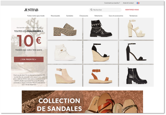
Let's take the example of the Justfab website. On the surface, it is a classic online shoe shop that highlights very attractive prices and free delivery. Throughout the visitor's path on the website, they speak of becoming a VIP customer but at no time do they explicitly and clearly say that the user is in fact committing to a monthly subscription of €39.95. Of course, the cancellation procedure is complex and the information is difficult to find. Customers often become aware of the scam only after their accounts have been debited several times. There are an enormous number of forums with testimonies of unhappy customers, which does not seem to convince the brand to change its sales model.

2. Confirmshaming
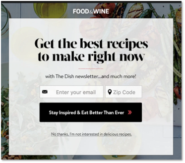
This consists of using words to make the user feel guilty if they refuse to carry out an action.
In particular, this method can be used to:
- Incite you to subscribe to a newsletter;
- Prevent you from unsubscribing.
The two examples below speak for themselves.

3. Disguised Ads
These are adverts that, as their name indicates, appear on the pages as if they were part of the content or page navigation. This supposes that the user will be more likely to click on them.
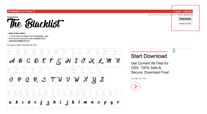
The example below comes from the Dafont website. To download the selected font, the user has a small button at the top right (red box), whereas an advert indicating a download is positioned right next to the fonts (black box). This advert uses the same colours as the website. The user may think it is the button to download the font and click it by error.
4. Force Continuity
This is when you subscribe to a free trial that requires you to enter your bank data. When the trial period comes to an end, you begin to pay without being notified beforehand. And, of course, there is no simple way to cancel it.
This is the method that Amazon, in particular, uses to encourage subscription to Amazon Prime.
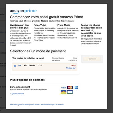
In fact, when you purchase an article on Amazon, the platform suggests you sign up for a free trial of the Prime service by simply entering your bank data. Of course, no alert warns you that your trial period is coming to an end and it is difficult to find the unsubscribe feature.
5. Friend Spam
This is when a site or a contest asks for access to your data (as well as your contacts). The site pretends to use these data for a user experience that is better adapted to your expectations, but uses them later without your consent.
This is what LinkedIn does during the registration process. They access all your contacts to, they say, help you find your contacts and it fact send them an email in your name to encourage them to sign up too.
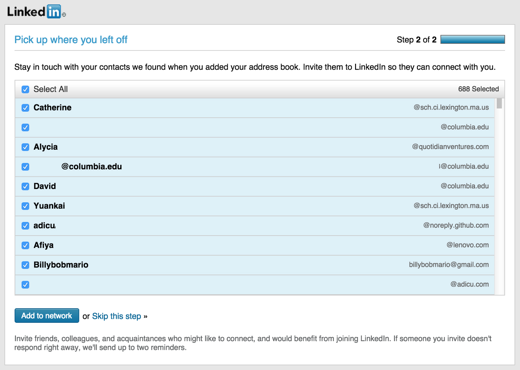
In 2015, LinkedIn was sentences to a fine of 13 million dollars for this illegal practice.
6. Roach Motel
This is when you have signed up for a newsletter or created an account on a site and you want to unsubscribe or remove it. You are trapped in a maze that is difficult to find your way out of.
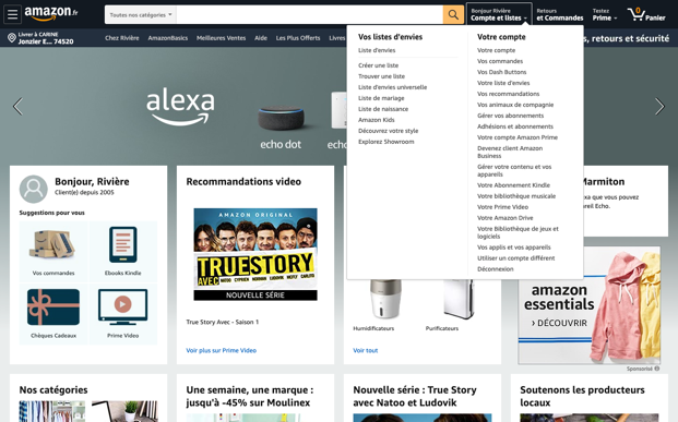
This is the case of Amazon: signing up is very easy. But it is a real obstacle course when you want to unsubscribe. The proof in pictures...
https://www.youtube.com/watch?time_continue=130&v=kxkrdLI6e6M&feature=emb_logo
7. Trick Questions
This technique tries to confuse the user by using a complex expression so that they don't really understand what they are accepting.
For example, "Sky may contact you about products and services you may like unless you click to opt out" or "Do not uncheck this box if you wish to be contacted by email...".

8. The fear of missing out
This is when the user is led to believe that a product is in high demand by pressuring them to make a quick decision to purchase. The user believes that if they don't buy now, they will miss out on the opportunity.
Among the specialists in the field, there are a number of online hotel reservation sites, including booking.com:
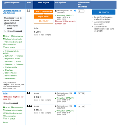
'5 users are looking at this page', 'Only one room left'. Everything is designed to put the user under pressure. Booking.com pushes this so far as to display hotels that are not available. Even though this information is totally useless for the user, it contributes to creating a stressful situation.
In December 2018, Boohoo was accused of offering fake sales promotions. In fact, they put users under pressure by displaying a meter at the top of the web page that simulated the time remaining until the end of the offer. It was, of course, a fake meter and once it reached 0 the offers continued. It was another way of putting pressure on users.
The consequences of these practices.
Even if these companies benefit in the short term (new customers, more sales, etc.), it is not a viable strategy over the long term.
There are numerous risks:
- Damage to brand image: this type of practice can give consumers a poor image of the brand.
- Greater difficulty to acquire new customers: it has become common practice to gather information before purchasing on a website by consulting the reviews of the brand, either by word of mouth or by going to dedicated websites. These persons will certainly choose another vendor.
- Less loyalty: once a user has been tricked, they will be less likely to make another purchase on the site.
- A lawsuit! As was the case for LinkedIn and Boohoo...
Our recommendation: ethical design
As UX designers, we combat for ethical design, i.e. design that gives users maximum control.
Certain specialists in the field have imagined solutions:
- In 2013, Gary Bunker suggested that designers adhere to a code of ethical conduct under which privacy, honesty and respect would be essential elements. However, there was nothing to oblige these designers to obey these rules.
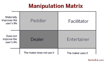
- Nir Eyal, author of Hooked, published in 2014, proposed a different solution. In his book, he speaks of persuasive design and explains how a good understanding of cognitive science can add value to the user experience. He speaks of the 'Hook Model', which gives designers the power to design addictive products. He realised that his model could be used with maliciously and cause ethical problems. He thus created the manipulation matrix. This matrix helps designers answer this question: 'Am I ripping off the users?'
- Finally, a recent solution that has proven its effectiveness: the General Data Protection Regulation (GDPR). In force since 2018, the GDPR provides a framework for the treatment of personal data within the European Union. It reinforces citizen control over the use that can be made of data concerning them.
Conclusion:
From an ethical point of view and taking into account the fact that the memory of an unpleasant experience remains more firmly rooted than that of a positive experience, it is important to try not to trick one's users. The job of a good UX designer is to design a fluid and pleasant experience that will enable the user to create an emotional bond with the brand. If this bond of trust is broken, it could entail serious risks for the company.
We Create Continuous Relationship Experiences !


